
Most apps that struggle with paid UA share one trait: their core value is invisible. Meditation, budgeting, habit tracking, and productivity apps can't show a flashy gameplay loop or a physical product. Yet according to AppsFlyer's 2025 State of App Marketing, non-gaming app install ad spend grew 15% year-over-year.
This guide breaks down exactly how to build high-performing creatives when you can't simply demo your app.
Prerequisites: You should have a live app with at least basic analytics (trial starts, retention events, or revenue events) configured in an MMP like AppsFlyer or Adjust. You'll also need a creative production workflow capable of producing at least 5-10 ad variants per testing cycle. Familiarity with at least one major ad platform (Meta, Google, TikTok) is assumed.
Page Contents
Step 1: Why are abstract apps so hard to advertise, and what makes them different?
Abstract apps sell invisible outcomes: less stress, better finances, improved focus. You can't screenshot a feeling, which is why demo-style ads that work brilliantly for photo editors or games fall flat for meditation or budgeting apps.
According to Adjust's 2025 State of App Growth report, lifestyle and health apps see 30-day retention rates of just 5-7%, partly because users never fully grasp the value proposition before churning.
The ad itself is your first and sometimes only chance to communicate a transformation that takes weeks to experience.
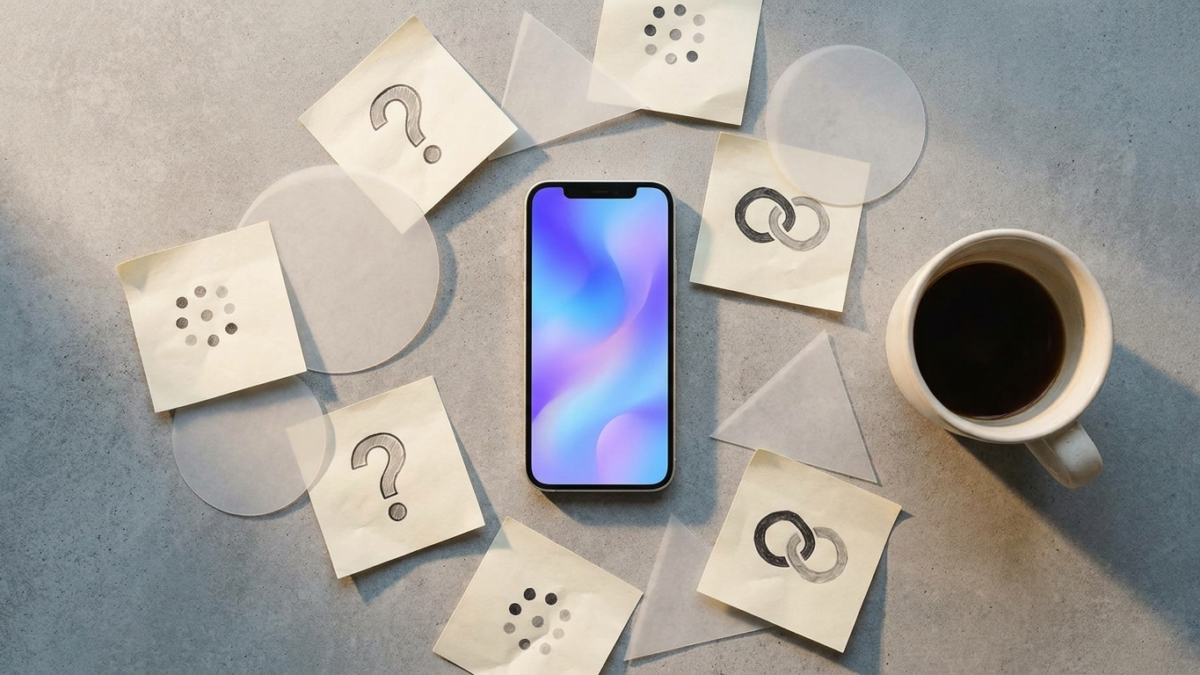
The fundamental challenge is a visualization gap. Gaming apps show gameplay. E-commerce apps show products. But what does "financial peace of mind" look like in a 6-second hook? Solving this gap is the entire creative problem.
Key insight: Abstract apps sell invisible outcomes, so your ad must make the intangible feel tangible.
- Core value is experiential, not visual
- Demo ads underperform for non-visual products
- Retention depends on pre-install expectation setting
- The ad itself shapes perceived value
- Visualization gap is the central creative challenge
| App Category | Can Demo Core Value? | Primary Ad Challenge |
|---|---|---|
| Photo/Video Editors | Yes (before/after) | Creative fatigue |
| Mobile Games | Yes (gameplay clips) | Matching ad to gameplay |
| Meditation/Wellness | No | Visualizing invisible outcomes |
| Finance/Budgeting | No | Making numbers emotional |
| Productivity/Habits | No | Demonstrating long-term behavior change |
Pro tip: If your app's value takes more than 7 days to manifest, your ads need to compress that transformation into 3-6 seconds of hook. Time-lapse metaphors work well here.
Step 2: What is the problem-first approach, and why should abstract apps lead with pain?
Lead with the problem your user is already feeling, not the solution you're selling. According to TikTok's own creative best practices, ads that open with a relatable pain point see 1.4x higher 6-second view-through rates compared to product-first openings.
For a budgeting app, "I checked my account and had $12 left with 9 days until payday" hits harder than "Track your spending with our intuitive dashboard." The first statement triggers recognition. The second triggers scroll.
Problem-first works because it exploits a cognitive shortcut: users self-select by recognizing their own experience.
This filters for intent, which is why problem-led creatives consistently deliver 20-35% lower cost-per-trial compared to feature-led variants in subscription app campaigns, according to patterns documented across AppsFlyer's eCommerce benchmarks and applicable to broader non-gaming categories.
Key insight: Problem-first hooks self-select high-intent users and consistently cut cost-per-trial.
- Open with a pain the user already feels
- Specificity beats generality in hook copy
- Problem recognition triggers self-selection
- Feature-first openings cause immediate scroll
- Aim for emotional recognition within 2 seconds
How do you identify the right pain points to lead with?
Mine your app's 1-star and 3-star reviews on competing apps, not your own. One-star reviews reveal acute frustrations. Three-star reviews reveal unmet expectations, which are goldmines for ad hooks.
Reddit threads and community forums (r/personalfinance, r/meditation, r/productivity) surface raw, unfiltered language. Use the exact phrasing your audience uses. "I can never stick with meditation" is a better hook than "Struggling to build a mindfulness habit?"
Also survey churned users. Ask "What were you hoping this app would do for you?" The gap between expectation and reality is your hook.
How do you structure the problem-first narrative arc?
Use a 3-beat structure: Pain (0-3 seconds), Bridge (3-8 seconds), Outcome (8-15 seconds). The pain is the hook. The bridge is the mechanism ("This app does X"). The outcome is the transformed state.
Keep the pain beat visceral and specific. "I was $4,200 in credit card debt and too scared to open my banking app" is a real human moment. The bridge should be brief: one sentence about the app.
The outcome should mirror the pain beat but inverted: "Now I check my balance every morning and smile."
Pro tip: Test 5 different pain points per creative cycle. The pain point that wins often surprises you, as it's rarely the one your product team thinks is most important.
Step 3: How does outcome visualization work in ads for intangible products?
Outcome visualization shows the after-state of using your app, not the app itself. For Calm or Headspace, that's a person waking up refreshed. For YNAB or Mint, that's someone confidently saying yes to a dinner invitation because they know their budget.
According to Meta's creative research, ads featuring people experiencing positive outcomes generate 27% higher ad recall than ads showing product interfaces. This is especially pronounced in health, wellness, and finance verticals.
The technique works because humans are wired to project themselves into scenarios. When a viewer sees someone sleeping peacefully, they don't need to see the meditation app's UI. They mentally bridge the gap themselves, which creates stronger purchase intent than any feature walkthrough.
Key insight: Show the transformed life state, not the app interface, to drive stronger recall and intent.
- Depict the after-state, not the during-state
- People in positive scenarios outperform UI screenshots
- Let the viewer mentally connect outcome to product
- Emotional projection drives stronger purchase intent
- Pair outcome visuals with minimal app branding
| App Type | Weak Outcome Visual | Strong Outcome Visual |
|---|---|---|
| Meditation | Timer screen showing 10 min session | Person stretching calmly at sunrise |
| Budgeting | Pie chart of spending categories | Person confidently paying a bill, smiling |
| Habit Tracker | Streak counter at 30 days | Person running outdoors, looking strong |
| Journaling | Text editor with prompts | Person closing a notebook and exhaling peacefully |
| Productivity | Task list with checkmarks | Person closing laptop at 5pm, walking outside |
What specific visual techniques make outcomes feel real?
Use sensory-rich imagery. Morning light, steam from coffee, the sound of an alarm being turned off before it rings. These details make abstract outcomes feel physical and achievable.
Time compression is powerful: show a 30-day calendar flipping rapidly with the person visibly transforming. This works exceptionally well in vertical video formats on TikTok and Reels, where according to TikTok's Creative Center, transformation-style content has been a consistent top performer in the health and lifestyle categories.
Pro tip: Film outcome scenes in warm lighting with natural environments. According to Meta's internal creative analysis, warm-toned visuals drive 15-20% higher completion rates in wellness category ads compared to cool, clinical aesthetics.
Step 4: How do metaphors and visual analogies make abstract value concrete?
Metaphors translate invisible value into something the viewer can see and instantly understand. A meditation app showing a chaotic snowglobe settling into stillness communicates the experience better than any UI walkthrough.
This technique is especially effective in the first 3 seconds. According to research from the Nielsen Norman Group, visual metaphors are processed 60% faster than literal representations because they leverage existing mental models.
Budgeting apps can show a leaking bucket being patched. Productivity apps can show a tangled rope being untangled. The metaphor does two things simultaneously: it names the problem and implies the solution, all without a single word of copy.
Key insight: Visual metaphors communicate abstract value in under 3 seconds by leveraging existing mental models.
- Metaphors name the problem and imply the solution
- Visual analogies process faster than literal UI
- Snowglobe, untangling rope, leaking bucket all work
- Use metaphors specifically in the hook (0-3 sec)
- Pair metaphors with a simple text overlay
What are proven metaphor frameworks for each category?
For meditation and mental health apps, water metaphors dominate: choppy waves becoming calm, murky water clearing, rain stopping. These tested well because they're universally understood and culturally neutral.
For finance apps, container metaphors resonate: jars filling up, holes being plugged, scales balancing. For productivity apps, motion metaphors work best: paths clearing, fog lifting, knots unraveling.
Avoid metaphors that require cultural context or explanation. If the viewer has to think about what the metaphor means, you've already lost them. The metaphor should be self-explanatory in under 2 seconds.
How do you test metaphors systematically?
Create 3-4 metaphor-based hooks and pair each with the same body and CTA. Run them in a creative testing framework on Meta or Google with identical targeting.
Allocate at least $500 per variant to reach statistical significance, per guidelines from Meta's Ads Manager documentation on creative testing. Measure hook rate (3-second view / impression) and cost-per-trial to identify the winning metaphor.
Pro tip: The best metaphors are ones your users already use in reviews. If users say "this app cleared the fog in my head," use fog literally in your ad creative.
Step 5: How do user stories and testimonials perform for hard-to-demonstrate apps?
User-generated content and testimonial-style ads are the highest-performing creative format for abstract apps. According to the 2025 AppsFlyer Performance Index, UGC-style creatives on Meta and TikTok consistently rank among top-performing formats in non-gaming categories.
The reason is simple: when the product is invisible, the person becomes the product. A real user describing how they paid off $8,000 in debt using a budgeting app is more compelling than any animation or UI demo. The specificity of their story does the selling.
Need help scaling your mobile app growth? Talk to RocketShip HQ about how we apply these strategies for apps spending $50K+/month on UA.
There's a critical distinction between polished testimonials and authentic stories. Polished testimonials feel like ads. Authentic stories, filmed on a phone with natural lighting and conversational delivery, feel like recommendations from a friend.
The latter consistently outperforms, with 2-3x higher click-through rates according to common patterns in Adjust's growth benchmarks.
Key insight: When the product is invisible, the person telling the story becomes the product.
- UGC-style outperforms polished testimonials
- Specific dollar amounts and timelines build credibility
- Film on phones, not studios
- Real users outperform actors in abstract categories
- Story arc: before state, discovery, transformation
| Testimonial Element | Weak Example | Strong Example |
|---|---|---|
| Specificity | This app changed my life | I saved $3,400 in 6 months |
| Filming | Studio with ring light | Kitchen table, natural light |
| Delivery | Scripted, teleprompter | Conversational, some pauses |
| Length | 60 seconds monologue | 15-25 seconds focused story |
| CTA | Download now! | I wish I'd started sooner |
How do you source authentic user stories at scale?
Post in-app prompts after milestone events: 30-day streak, first savings goal met, first completed meditation course. Ask users to share a 15-second video of their experience in exchange for a free month of premium.
You can also source stories from Reddit, TikTok, and app review sites. Reach out to users who've already posted organically about your app. Their words are pre-validated. Just ensure you get proper usage rights before running their content as ads.
Services like Billo and Trend offer UGC creator marketplaces where you can brief creators on your specific pain points and outcomes. Budget $150-300 per creator video for decent quality at scale.
Pro tip: The most effective testimonial hook is a specific number delivered in the first 2 seconds. "I saved $3,400" or "I've meditated for 147 days straight" stops the scroll because it's concrete and aspirational.
Step 6: How do you use lifestyle context to sell an invisible product?
Lifestyle context means embedding your app's value into a recognizable daily moment. Instead of showing the app, show the life the app enables. This is how brands like Headspace and Calm have built creative programs that scale.
The technique works by anchoring abstract value to a specific time and place: the morning commute, the 3pm energy crash, the Sunday night anxiety before Monday.
According to strategies documented for social app advertising, context-anchored creatives see 18-25% higher relevance scores because they meet users in a moment they already recognize.
Lifestyle ads don't need to mention the app until the final 3-5 seconds. The first 10 seconds should feel like a slice of the viewer's actual life. Only after they've seen themselves in the scene do you introduce the app as the reason this person's life looks this way.
Key insight: Anchor your app's value to a specific daily moment the viewer already lives through.
- Embed value in recognizable daily routines
- Don't show the app until the final seconds
- Morning, commute, and bedtime are top contexts
- The viewer must see themselves in the scene
- Context-anchoring boosts relevance and recall
Which lifestyle moments work best for each app category?
Meditation apps: waking up before the alarm, staying calm in traffic, falling asleep easily. Finance apps: confidently splitting the check, saying yes to a vacation, opening the mail without dread.
Productivity apps: closing the laptop at a reasonable hour, not checking email on weekends, having a clean desk. Habit apps: morning routines, gym arrivals, water intake throughout the day.
The key insight is that each moment should be aspirational but believable. Showing someone on a yacht is too far removed. Showing someone calmly handling a toddler's tantrum is relatable and aspirational.
Pro tip: Film lifestyle scenes that match your top-performing geo. If 60% of your installs come from the US, shoot in settings that feel distinctly American: suburban kitchens, open-plan offices, Target parking lots.
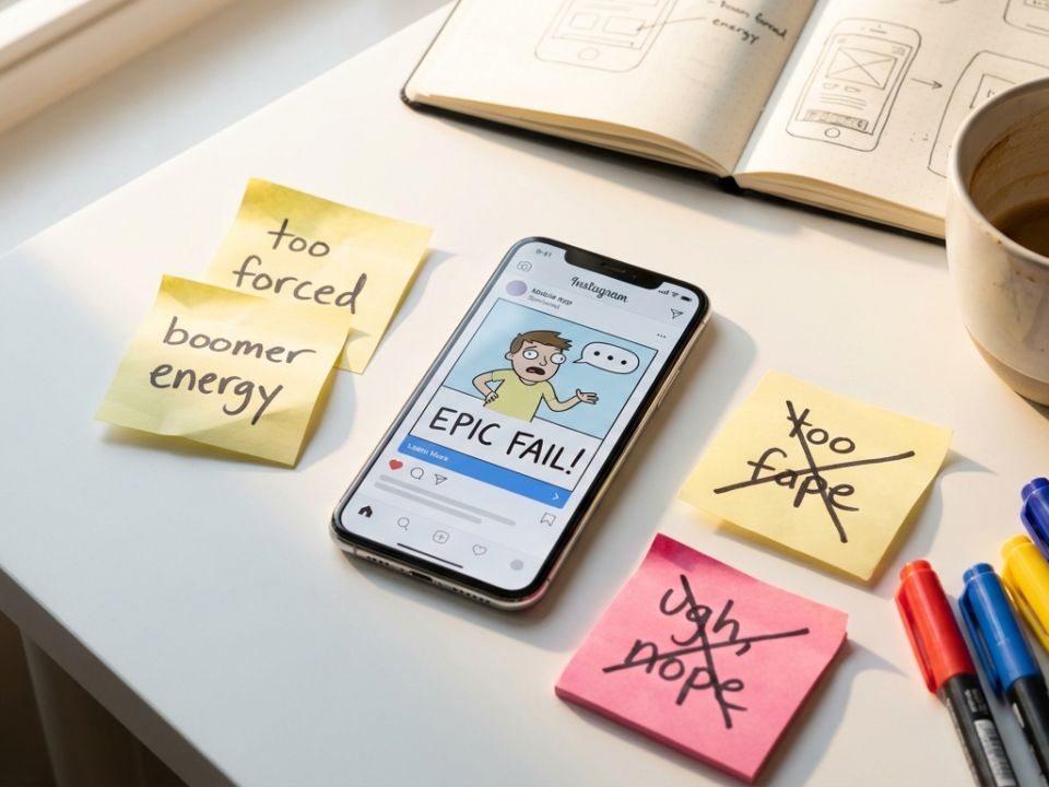
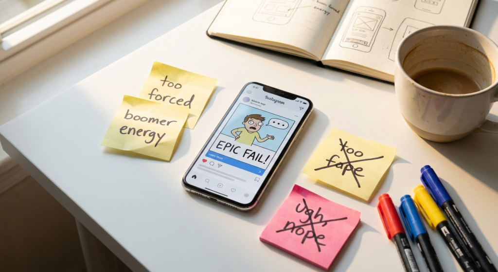
Step 7: How do you avoid feature dumps, and why do they kill performance?
Feature dumps list capabilities instead of communicating value. "Track expenses, set budgets, view reports, sync accounts, get alerts" is a feature dump. It tells the viewer everything the app does and nothing about why they should care.
According to data from Liftoff's 2024 Mobile Ad Creative Index, ads with more than 3 value propositions in a single creative see completion rates drop by 40%. Cognitive overload causes disengagement, especially on mobile where attention windows are measured in seconds.
The fix is ruthless prioritization. Pick one outcome per ad. One. "This app will help you save your first $1,000" is infinitely more compelling than a bullet list of 8 features. You can cover other features in other ads within the same campaign.
Key insight: One outcome per ad. Multiple value propositions in a single creative cause cognitive overload.
- Feature lists tell everything and sell nothing
- More than 3 value props kills completion rates
- Pick one outcome per creative
- Cover additional benefits in separate ad variants
- Features are for the app store, not the ad
| Approach | Example Copy | Avg. CTR (Non-Gaming) | Avg. CPT |
|---|---|---|---|
| Feature Dump | Track, budget, sync, alert, report | 0.4-0.6% | $18-25 |
| Single Outcome | Save your first $1,000 this year | 1.0-1.8% | $8-14 |
| Problem-First + Outcome | Tired of being broke? Save $1K in 90 days | 1.2-2.1% | $6-12 |
How do you decide which single outcome to feature?
Look at your highest-converting in-app event. If users who set a savings goal in week 1 have 3x higher LTV, your ad should be about setting that first goal and the emotional payoff of hitting it.
Correlate your activation events with long-term retention. The feature most correlated with Day 30 retention is the one your ad should sell. This alignment between ad promise and in-app experience also improves post-install metrics, which feeds back into algorithmic optimization on platforms like Meta and Google.
Pro tip: Run a simple test: show your ad to someone for 5 seconds and ask them what the app does. If they list features, it's a dump. If they describe an outcome, you've nailed it.
Step 8: What creative formats work best for abstract app categories on each platform?
The optimal format varies dramatically by platform. On Meta, static images with bold outcome statements still drive efficient installs for finance and productivity apps, with CPIs 15-25% lower than video in some subscription app categories, according to patterns noted in channel selection benchmarks.
On TikTok, raw UGC video is non-negotiable. Polished content gets ignored. According to TikTok's Creative Center, top-performing ads in health and lifestyle use native-feeling content filmed on smartphones.
Google App Campaigns require a mix of assets: short text headlines, landscape and portrait video, and HTML5 interstitials. The full breakdown of required Google App Campaign creative assets is essential reading, but for abstract apps specifically, text assets with outcome-driven copy tend to outperform generic descriptions.
Key insight: Match the creative format to the platform's native content style, not your brand guidelines.
- Meta: static outcome images still competitive
- TikTok: raw UGC video only
- Google: outcome-driven text assets are critical
- Apple Search Ads: custom product pages per pain point
- Reels and Shorts reward authenticity over production
| Platform | Best Format for Abstract Apps | Avg. CPI (Subscription) | Key Creative Principle |
|---|---|---|---|
| Meta (Facebook/IG) | Static cards + 15s UGC video | $2.50-4.00 | Outcome-first headline |
| TikTok | 15-25s raw UGC video | $1.50-3.00 | Native, unpolished feel |
| Google App Campaigns | Text + portrait video mix | $1.80-3.50 | Outcome-driven text headlines |
| Apple Search Ads | Custom product pages | $2.00-5.00 | Keyword-aligned messaging |
| Snap | 6-10s vertical video | $1.20-2.50 | Quick transformation arcs |
Pro tip: On TikTok, the first frame matters more than anything else. According to TikTok's creative research, ads where the speaker makes eye contact in the first frame see 2x higher hook rates compared to text-only openings.
Step 9: How should you structure creative testing for abstract apps?
Testing creative for abstract apps requires testing concepts, not just executions. A concept is the core idea (problem-first vs. outcome visualization vs. metaphor). An execution is the specific creative within that concept. Most teams test executions when they should be testing concepts first.
Allocate 70% of creative testing budget to concept testing and 30% to iterating on winning concepts. This approach, which RocketShip HQ calls concept-first testing, ensures you're not optimizing a fundamentally weak idea.
For early-stage apps, concentrating spend on 1-2 channels is critical. Spreading $100-200/day across 4-5 channels means no single channel accumulates enough conversion data for the algorithm to optimize. Focus your testing budget on one platform until you find 2-3 winning concepts, then expand.
Key insight: Test concepts first (problem vs. outcome vs. metaphor), then iterate on the winning concept.
- Concept testing before execution testing
- 70/30 budget split: concepts vs. iterations
- Focus on 1-2 channels initially
- Need 50+ conversions per ad set for learning
- Kill losers fast, iterate winners aggressively
What does a concept testing matrix look like?
Build a 3×3 matrix: 3 concepts (e.g., problem-first, outcome visualization, user story) x 3 hooks (different pain points or outcomes). This gives you 9 variants per testing cycle.
Run each variant with identical targeting, bidding, and budget. Use cost-per-trial or cost-per-subscription as your primary KPI, not CPI. For subscription apps, a creative that drives $2.00 CPI but $25 cost-per-trial is worse than one with $3.50 CPI but $12 cost-per-trial.
Allow 5-7 days per test cycle to exit the learning phase. According to Meta's documentation, ad sets need approximately 50 optimization events per week to complete the learning phase.
How do you iterate on winning concepts?
Once you identify a winning concept, create 5-8 variations that keep the core idea but change surface elements: different actors, different specific numbers, different settings, different text overlays.
Also test format variations of the winner: turn a winning video into a static card, a carousel, and a Reels-specific cut. Cross-format adaptation often extends the life of a winning concept by 3-4 weeks before creative fatigue sets in.
Pro tip: Label every creative with a naming convention that encodes the concept, hook, and format. Example: PROB_DebtAnxiety_UGC_15s_v2. This makes performance analysis across hundreds of creatives manageable.
Step 10: How do you handle compliance for regulated abstract categories like fintech?
Finance, health, and wellness apps face platform-specific ad policies that restrict claims. Making unsubstantiated promises ("Save $10,000 this year!" or "Cure your anxiety!") can get your ad account suspended.
According to fintech ad compliance guidelines, platforms like Meta and Google require disclaimers on financial ads and prohibit before/after claims for health apps without clinical evidence. TikTok's financial services policy is even stricter in certain markets.
The solution is to frame outcomes as user experiences, not guarantees. "I saved $3,400" (a user story) is compliant. "You will save $3,400" (a guarantee) is not.
This distinction is critical and is one reason why UGC testimonial formats are not just more effective for abstract apps but also more compliant.
Key insight: Frame outcomes as user experiences, not guarantees, to stay compliant on regulated platforms.
- User stories are more compliant than direct claims
- Add disclaimers for financial projections
- Avoid before/after health claims without evidence
- TikTok's fintech policy is strictest
- "I saved" is compliant; "you will save" is not
Pro tip: Build a compliance checklist for each platform and review every creative against it before launch. A single rejected ad can trigger account-level review and pause all running campaigns.
Step 11: What role does sound design play in ads for intangible products?
Sound is an underutilized weapon for abstract apps. While 85% of Facebook video is watched without sound according to widely cited Digiday research, the remaining 15% who hear sound convert at significantly higher rates. For meditation and wellness apps, sound is actually the product.
Calm's famous "Take a deep breath" ads work primarily through audio. The calming voice, ambient sounds, and deliberate pacing create a micro-experience of the app itself. This is a technique called experiential sampling: giving the viewer a tiny dose of the product experience within the ad.
For finance and productivity apps, sound design sets emotional tone. Upbeat, confident music paired with outcome visuals creates an association between the app and positive energy. Avoid generic stock music.
According to best practices from audio app advertising, custom or curated audio tracks see 10-15% higher completion rates than stock alternatives.
Key insight: For apps selling feelings, sound is experiential sampling: a micro-dose of the product in the ad itself.
- Sound creates experiential product samples
- Meditation apps: calming voice IS the product demo
- Custom audio outperforms stock music
- Design for sound-off first, then enhance for sound-on
- ASMR-style audio hooks perform well on TikTok
Pro tip: Create two versions of every video: one optimized for sound-off with bold captions, one optimized for sound-on with voiceover and audio design. Test both. For wellness apps, the sound-on version often delivers 25-30% lower CPA.
Step 12: How do you measure creative performance beyond installs for abstract apps?
For abstract apps, CPI is a misleading metric. What matters is cost-per-meaningful-action: trial start, first completed session, savings goal created, or first journal entry. These post-install events tell you whether your ad attracted the right users.
According to RevenueCat's 2025 State of Subscription Apps, the median trial-to-paid conversion rate for subscription apps is 15.8%. If your creative drives cheap installs but trial-to-paid drops below 10%, your ads are attracting the wrong audience.
Set up a creative scorecard that tracks: hook rate (3s views / impressions), CTR, CPI, cost-per-trial, trial-to-paid rate, and Day 7 retention by creative. This full-funnel view prevents you from scaling creatives that win on vanity metrics but lose on revenue.
Key insight: CPI is misleading for abstract apps. Measure cost-per-trial and trial-to-paid to evaluate creative quality.
- CPI is a vanity metric for subscription apps
- Track cost-per-trial as primary creative KPI
- Monitor trial-to-paid rate per creative
- Day 7 retention by creative reveals quality
- Build a full-funnel creative scorecard
| Metric | What It Tells You | Benchmark (Subscription Apps) |
|---|---|---|
| Hook Rate (3s views/impr) | Is the hook stopping the scroll? | 25-35% |
| CTR | Is the concept compelling enough to click? | 0.8-2.0% |
| CPI | How efficient is the install? | $1.50-4.00 |
| Cost-per-Trial | Are you attracting potential subscribers? | $6-18 |
| Trial-to-Paid | Did the ad set correct expectations? | 12-20% |
| Day 7 Retention | Is the creative attracting sticky users? | 15-25% |
How do you attribute post-install events back to specific creatives in a post-ATT world?
In iOS campaigns post-ATT, deterministic creative-level attribution is limited. Use modeled approaches like those described by Faith Price at DoubleDown Interactive: analyze creative cohorts rather than individual ad IDs.
On Android, creative-level post-install data remains more accessible through MMPs. Use this data to inform iOS creative decisions. If a problem-first UGC concept wins on Android, it's likely to win on iOS too, even if you can't directly measure it.
Meta's Aggregated Event Measurement (AEM) allows up to 8 prioritized events. Make your primary conversion event (trial start or subscription) the top-priority event to preserve creative-level signal.
Pro tip: Review creative performance weekly but make scaling decisions on 14-day cohorted data. Early CPI can be misleading. The creative that looks expensive on Day 1 sometimes delivers the best trial-to-paid by Day 14.
Common Mistakes to Avoid
- Mistake 1: Leading with the app's UI instead of the user's problem, dropping hook rates by 40-60%.
- Mistake 2: Listing 5+ features in a single ad, causing cognitive overload and lower completion rates.
- Mistake 3: Using actors in overly polished studio settings, which kills authenticity on TikTok and Reels.
- Mistake 4: Optimizing for CPI instead of cost-per-trial, attracting cheap installs that never convert.
- Mistake 5: Testing executions before concepts, wasting budget iterating on fundamentally weak ideas.
- Mistake 6: Ignoring sound design, losing a powerful tool for experiential product sampling.
- Mistake 7: Spreading budget across 4-5 channels at $50/day each, starving algorithms of learning data.
Advertising abstract apps requires a fundamental shift: stop showing the product and start showing the transformation. Start this week by auditing your current cre
Frequently Asked Questions
Can I use before-and-after ads for abstract apps like meditation or therapy?
Yes, but with caution. Before-and-after formats work well when the transformation is emotional (stressed to calm) rather than clinical. Avoid medical claims. Frame transformations as user experiences, not guaranteed outcomes. Meta allows emotional before/after if no health claims are made.
How much creative budget should I allocate as a percentage of total ad spend?
Industry data suggests allocating 15-25% of total ad spend to creative production and testing, according to patterns in Adjust's growth data. For a $50K/month media budget, that's $7.5K-12.5K on creative. Underspending on creative is the single most common reason UA campaigns plateau.
Do fail ads work for non-gaming abstract apps?
Surprisingly, yes. Fail ad mechanics can be adapted for finance apps ("I ignored my budget and look what happened") or productivity apps ("Me trying to organize my life without this app"). The humor-through-failure format works whenever there's a relatable struggle.
Should I show my app's pricing in the ad creative?
For subscription apps, showing pricing in the ad itself is generally counterproductive. According to RevenueCat's data, apps that delay pricing until the paywall see 20-30% higher trial start rates. Let the ad sell the outcome and let the onboarding sell the subscription.
How do organic and viral strategies complement paid UA for abstract apps?
Organic content validates creative concepts before you spend on ads. DirtyBit achieved 100M installs without paid spend through viral loops. For abstract apps, posting problem-first content organically on TikTok and Reels first reveals which pain points resonate before committing ad dollars.
What's the ideal ad length for abstract app categories?
On TikTok, 15-25 seconds is the sweet spot. On Meta, 6-15 seconds for feed and 15-30 seconds for Reels. Per TikTok's Creative Center data, ads under 21 seconds see 280% higher conversion rates than ads over 60 seconds. Abstract apps don't need time to explain; they need impact.
How do bidding strategies differ for hard-to-demonstrate apps?
Bid on downstream events (trial start, subscription) rather than installs whenever possible. EA's bidding decision engine approach shows how sophisticated bidding aligns spend with true value. For abstract apps with lower install volumes, target-CPA bidding on trial events typically outperforms tCPI by 15-20% on ROAS.
How many creative variants should I be producing per month?
At scale, aim for 20-30 new variants per month across 3-4 core concepts. Most of these should be iterations on proven winners (new hooks, new actors, new settings), not entirely new ideas. According to industry norms cited in AppsFlyer's Performance Index data, top-spending non-gaming advertisers refresh creative every 7-10 days.
Looking to scale your mobile app growth with performance creative that delivers results? Talk to RocketShip HQ to learn how our frameworks can work for your app.
Not ready yet? Get strategies and tips from the leading edge of mobile growth in a generative AI world: subscribe to our newsletter.

