
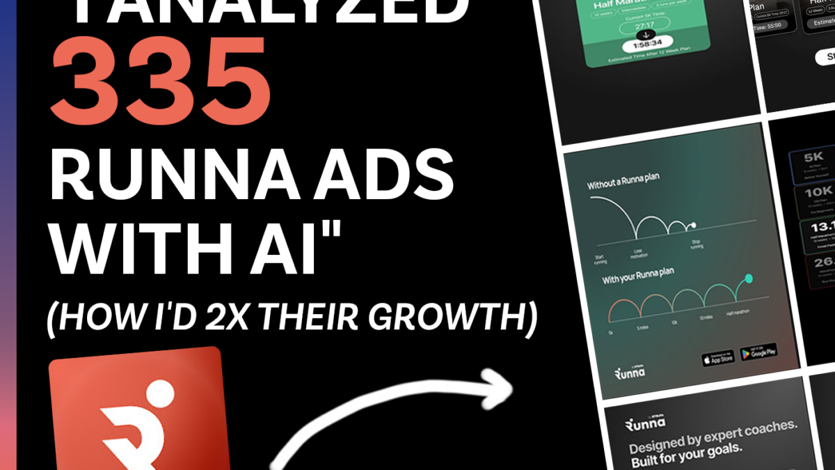
In this episode, Shamanth analyzed 335 Runna display ads and 1,035 app store reviews. Zero ads teach the viewer anything about running.
335 display ads analyzed | 1,035 reviews read | 4.29 average rating | 72% five-star THE THREE OPPORTUNITIES 1.
1.The Emotional Gap The pattern: 73% of review sentiment is love, joy, gratitude, and fun. 1.5% of ads convey any of it. Joy, gratitude, fun, learning each appear in zero ads.
The fix: Build creative around the emotions reviewers actually report. Joy. Belonging. Love.
2. The Non-Runner Conversion Story The pattern: 48 reviewers self-identify as non-runners before Runna. 94% of ads assume you already are one.
The fix: An ad that lives in the non-runner identity, with copy drawn from the review quotes.
3. No Education, Just Aspiration The pattern: 0 of 335 ads teach the viewer anything about running. 56% of hooks are plan names.
The fix: Demonstrate coaching expertise. Pacing tips. Form. Training science. Build trust, then the download follows.
THE UNLOCK : The product creates runners. The ads just need to show what that feels like.
ABOUT ROCKETSHIP HQ: Website | LinkedIn | Newsletter | Youtube | Podcast Website
FULL TRANSCRIPT BELOW
Deconstructing Runna’s Ad Strategy: Three Big Opportunities
I deconstructed 335 display ads and 1,035 reviews for Runna to understand their creative strategy and identify what they could do better to take it to the next level.
They are one of the top health and fitness advertisers, and there are a lot of things they are doing really well. They had 400K downloads last month and over four million in revenue last month.
They are also testing ads very aggressively. Most ads that don’t work seem to be getting cut quickly. They have a strong testing process in place.
Let’s look at their top ads.
The top ads in the EU by reach are these three. The first says “Strava’s running training app” and they’re leaning on the brand equity of Strava, who acquired them some time ago. It shows a grid with different plans. The second is also a set of cards with different plans. The third focuses on and emphasizes one single plan.
These are the longest running ads in the US. Again, the same sequence of cards emphasizing plans, that’s the longest running ad. The second is a split screen showing you now and you in 16 weeks, future pacing. The third also shows a set of cards outlining their biggest plans.
These are their longest running and most popular ads, but if you look at what they’re running on the Meta ad library, it looks fairly similar with some differences.
Some ads emphasize personalization, showing that users can pick different settings based on their goals. There are ads that show runners, more personalization, and user goals like running a marathon, 10K, half marathon, full marathon.
These are not their top three in the US or EU, but they give you a good idea of what they’re testing.
Now, let’s look at the opportunities they’re sitting on.
I did this entire review using our AI agent, Brute Force AI, which reviews every single ad frame by frame to unearth the semantic analysis of why an ad might be working. It also looks at the longest running ads, the ads with the biggest reach and unearths the patterns underlying an advertiser’s creative strategy. That’s what I’ve used to come up with this analysis and these recommendations.
So let’s get into it.
The first opportunity is to test emotionally resonant copy.
If you look at a lot of these ads, there are no headlines. There’s just a very small headline in some, but the vast majority don’t have one. That’s a missed opportunity. Emotionally resonant headlines should appear in the vast majority of ads.
They could talk about the hopes, dreams, and aspirations of their users, and they could use App Store reviews to build those headlines. These are actual reviews:
“I’m definitely not a runner. I’m about to compete in a 5K I’ve been working up to for five weeks.”
“Hated running, now I love it.”
“Started running at 53.”
These are powerful stories, and none of them come across in the display ads.
There are three big directions for going deeper with copy.
The first is I learned X about myself, self-discovery narratives. I learned I could actually complete a marathon. How I found out I needed to slow down at mile 20.
The second is I went from X to Y, transformation narratives. I went from being overweight to finishing my first marathon.
The third is progression-based narratives. Here’s my week one, here’s my week four, here’s my week 16.
These are powerful narratives they can use, and this is a huge missed opportunity.
One important thing to underscore. Yes, these narratives appeal to humans, but they also need to appeal to the algorithm. The algorithm is currently rewarding certain ad formats, so running a random ad with new copy could tank in the Meta auction.
What I would recommend is to take their top performing ads and add emotionally resonant copy as headlines. For example:
“How I learned I could finish a marathon at age 53.”
“How I went from being overweight and sedentary to finishing a 5K in 16 weeks.”
They can layer emotionally resonant copy onto their best performing ads. That is one direction.
The other direction is to test emotionally resonant copy on proven formats. iMessage style ads, wall of text, notepad style, listicles, infographic style. Take formats that are proven to work, layer on emotionally resonant messaging, speak to humans, and unlock growth and new audiences.
The second opportunity is the non-runner conversion story.
A lot of the ads talk about 5K, 10K, and half marathons. What they don’t talk about is the fact that many of their reviewers never ran before. We found 48 such reviews, and that’s a segment of their audience that is completely underserved by the ads.
That’s a huge opportunity that can unlock a very large target audience.
The angle here is the identity shift. From being a non-runner to becoming a runner, not just from a runner to a marathoner. It’s a subtle shift they are not capitalizing on right now.
The third opportunity is educational and instructive ads.
A lot of their ads are pitches or displays of product features. What’s inside the product, the aspirations of users, the goals of users. That’s all great.
What they don’t do is teach and instruct users. Ads that help users do something can be very effective, and that’s an angle they aren’t leaning into right now.
Here’s what that could look like.
“80% of runners set their pace too fast. Here’s what to do about it.”
“What are the missing ingredients in your marathon plan? Here’s what your week looks like.”
“Here’s your weekly challenge or monthly plan.”
“How is your running form? Here’s your running form test.”
You could also layer these onto their proven ad formats. Turn their grid ad into a listicle saying three ways to improve your form. Or use a wall of text saying here are three ways to improve your form.
The key is to lean on educational ad concepts to expand their audience and scale, while being mindful of what the algorithm is already rewarding and treating these as tests layered on top of what’s already working.
So in summary, Runna has a lot of product love, a strong testing discipline, and global reach. The big opportunities that would unlock the next level for them are deeper emotionally resonant copy, targeting non-runners, and more educational and instructive ad content.
I think all of these would take their creative strategy to the next level.
Click here to view the full deconstruction slide deck to see the frame by frame breakdown of these ads.
That’s all I had for today’s deconstruction. If you want to work with us to run a deconstruction like this or to design, create a strategy for your own product, feel free to reach out to us at rocketshiphq.com.


