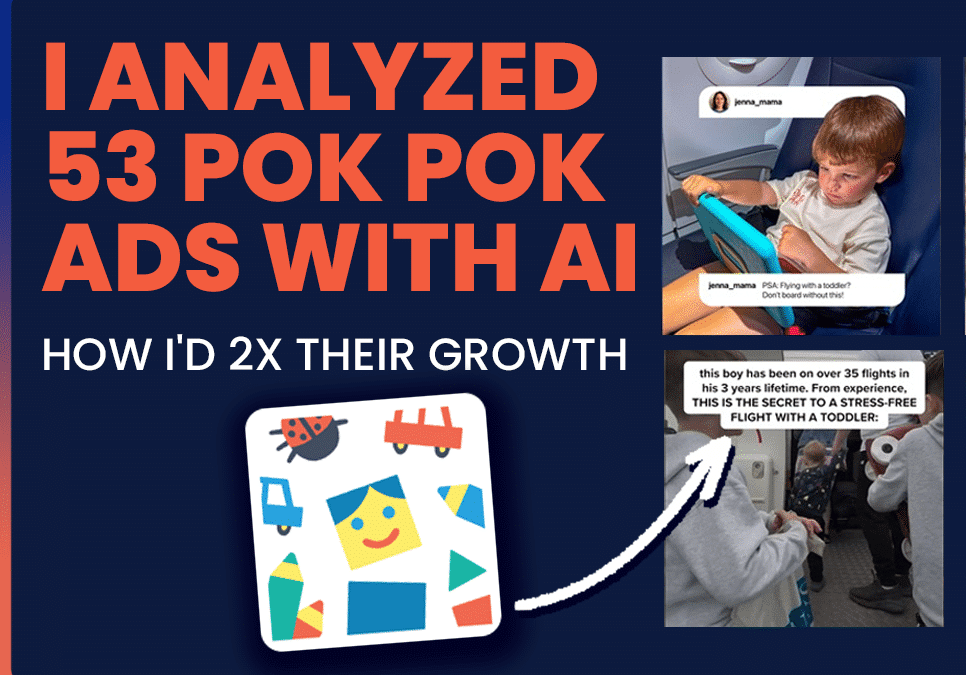
In this episode, I analyzed 53 Pok Pok ads with AI. Their creative system is solid. The next 2x is in three empty lanes.
53 ads analyzed | 997 reviews read | top EU performer = 1 creative across 3 ad IDs (1.66M reach)
- Teach the parent first
The pattern: anti-stimulation hooks land, but the ad stops at the hook.
The fix: use the middle of every ad to teach a real parenting framework. Pok Pok appears in the closing 25%.
- Port the relief sequence beyond travel
The pattern: travel is 26 of 53 ads; everyday-life lanes are 3 of 53.
The fix: take the cleanest travel walkthrough and re-shoot it in restaurant, waiting room, dinner table.
- Lead with imagination
The pattern: parents use imagination language in reviews; the ads never lead with it.
The fix: take the strongest travel shell and replace the generic play beat with a specific imagination invention.
The product has real love behind it. The creative system is solid. Three extensions and the library 3x’s its velocity without changing the brand.
ABOUT ROCKETSHIP HQ: Website | LinkedIn | Newsletter | Youtube | Podcast Website
FULL TRANSCRIPT BELOW
I deconstructed Pok Pok ads, and here’s how they can 2X their creative velocity. This is a product that I’ve actually reviewed for a while because I have a toddler at home, and we also work with a number of kids’ apps, so this was something I was excited to dive into. Let’s dive right into this.
First of all, they’re doing a lot of things really well. They’re testing a lot of concepts. I did a review of 53 ads and about 997 App Store reviews using our agent, Brute Force AI, to come up with this analysis and recommendations to see how they can 2X their creative velocity.
Let’s dive right into this. First of all, I looked at what their top-performing ads are the ads with the highest reach in the EU. For this ad, somebody walks up with an iPad, hands it over, and shows the iPad screen.
The first five or six ads basically have the same visual hook. Clearly, that’s a visual hook that’s working really well: somebody walking up and showing the iPad.
That seems to be working really well. If you look at their top US ads by longevity, these are the ones: “Best ad for traveling with toddlers.” And again, this person is sitting in a car, a kid is sitting on an airplane, and you can sort of see the theme here—that a lot of the ads seem to be about travel. Clearly, that is a pain point. Again, I have a toddler, and I can definitely relate to that.
What they’re doing well shows in some of the results that they have. This is from Sensor Tower, the one on top. They have Apple’s Editor’s Choice; they’ve been featured a number of times. You can see they do a lot of things really well.
Again, this exercise is not so much to criticize them, but to really understand and share what I would do if I was their creative strategist and what I would do to take them to the next level. It’s very much selfish, but it’s also something that I hope they can learn from, and I hope you can learn from as well.
Once I reviewed a lot of their best ads, this is the grammar of the winning scene: first, there’s a stress moment. The vast majority of these stress moments are travel-related. The device appears, the device is introduced, you show the app, you show the activity, you show the result, and then you close with the CTA.
This seems to be the structure. As I said, the vast majority of ads do seem to be travel-related because clearly that seems to be working well. I also reviewed some of their recent tests, and a lot of the recent tests seem to have travel-related ads as well.
So let’s get into what gets them to the next level. Number one would be in the relief sequence beyond travel. They have a lot of travel-related ads going on just now. Can they port it to other situations and other scenarios? Restaurants, waiting rooms, dinner, rainy afternoons, weekends.
They’ve done this to some extent; they do have some ads that show a person going in a car. But really, how can they double down on this with very similar scripts and very similar visual hooks to reduce their risks?
By the way, I don’t say some of this lightly because I understand from our own campaigns that it’s just hard. If the algorithm starts favoring travel-related ads, the algorithm keeps showing ads to parents who are interested in travel.
The algorithm just doesn’t give spend or performance to any of the other themes, and that’s a real problem. Which does not mean you shouldn’t do it; it just means you need to isolate that test.
You need to really double down on non-travel testing because once you do isolate the non-travel tests, you can unlock a completely new audience—a completely different audience that could be folks who don’t travel but go to restaurants often, and so on and so forth. I think that’s a big opportunity, and I would start by using very similar hooks and visual hooks but port them to a different scene.
The other big opportunity is teaching parents educational content. A lot of the current ads are problem- and solution-oriented, which is like, “Hey, you as a parent are stressed out. Here’s what makes this better for you.” Which is good. Now, I think a very different audience segment can be unlocked by having ads that are much more education-focused. And when I say education-focused, we’re really educating the parent about parenting. Here are some examples: three signs your toddler is overstimulated, why your kid melts down, the 4:00 PM witching hour.
Really have content that a parent can save, because every time we’ve tested content like this, we see there are a lot of shares, likes, and engagement. This means the algorithm is liking the stuff because humans like the stuff and humans save the stuff. Again, you can start with travel-related content: “Three signs your toddler is overstimulated on a flight,” and you can show flight-related visual hooks. You want to mitigate risks, but open up other directions and angles as well.
The other big opportunity is imagination. Kids and toddlers are very imaginative and they want to express themselves, which is something the app clearly allows them to do. The ads, again, are very problem-solution focused. There is a depiction of the app, and there are a couple of ads that talk about creativity, but it’s much more in the abstract. So my suggestion for them would be to really lead with imagination more often and test that as a creative lane.
Here’s what that could look like: again, you could lean into that with your travel-related hooks and visual hooks, travel-related scenarios and say, “Hey, here’s a travel-related theme. Let’s have imagination as a testing lane.” Again, the algorithm is going to favor their historical ads, but treat this as a separate test lane because this can unlock a very different audience.
In terms of the ad formats themselves, the format itself could be a wall-of-text ad, but the goal would be to treat this as a new lane that they could use to unlock completely new audiences.
In summary, continue to lean into what you’re testing, but try to unlock newer audiences because that’s where your next level of growth is going to come from. That’s what will allow you to 2X your creative velocity.
I hope this was helpful and instructive. If this is useful or helpful, please feel free to leave a comment below. Please feel free to share. Thank you so much.
And of course, if you’d like for us to do this type of analysis for your brand or produce creatives based on frameworks similar to this, hit me up at any point in time.
Thank you so much.